SEO optimization guide for mobile website

This article is intended to introduce to people about an aspect that has not been paid enough attention to – Optimizing for the mobile version of the website. The optimization here is not just about technical refinements or mobile SEO to increase rankings but also about improving user experience and increasing conversion rate.
And actually, at this point, SEO and conversion optimization are very close together, also everything you need to do to enhance the user experience and their interaction on the website, resulting in higher brand awareness, lower bounce rate, make the customers come back for more, and indirectly helps you rank better in search results.
If at this time, you still think that the majority of users use mobile phones primarily to listen, call, take pictures or check-in Facebook then you should probably rethink. Now is the era that over 90% of users search for information on their mobile phone, and over 50 % of them have ever made a purchase on their phones.
If you decide that it is time to focus on mobile users and need a mobile website, be aware that a website has three ways to display phone versions to viewers:
The first way: website with Responsive design, which can be displayed on all devices like computers, phones, and tablets with the same URLs. Each URL on these websites will often have the same HTML code for all devices but only use CSS to change the way it is displayed for each type of device. This is the way that the most popular search engine like Google loves and it is also the best for mobile SEO process.

The second way: Website with dynamic design (dynamic serving) aims to serve all devices on the same URLs, but depend on which device will access, it will generate different HTML code, CSS and sometimes, the designs are completely different.
This way is not preferred by the search engines because providing different content depending on the access object can have long been regarded as not good. If you have to do this, then make sure you use the Vary HTTP header to provide both the user and the search engines the correct web version based on that person’s access device.

The third way: There are two separate websites, one for computer and one for mobile devices. This is also a common solution and especially useful if the website is targeted at users who use older phone ( not smartphones). Older phones often do not have the ability to process CSS, so they need to have a separate page for better display. If you use your own mobile domain and website, it is important to pay close attention to the tag and use “canonical” and “alternate” tags to avoid the duplication of content, which is discussed below.
Common errors of mobile website

Mobile SEO is actually just another extension of the regular SEO technique because the mobile website is just an extension of a regular website and both should actually be one, at least For Google (that is why Google supports responsive design). Whether it is SEO for mobile or pure SEO, it must be based on developing content for the website, improving user experience and optimizing conversion rate. However, when conducting SEO for the mobile website, you first need to pay attention to some common mistakes made to ensure the mobile website is operating in the best way.
1. Redirect incorrectly
For example, redirect to the homepage, not to the content that the customer wants to. Redirecting incorrectly can cause the user to leave, increase the bounce rate, reduce the amount of time spent on the website, reducing the user experience. In addition, this also makes it difficult for search engines to crawl and index the site. In addition, this also makes it difficult for search engines to crawl and index the site. Surprisingly, this is one of the most common misconceptions of a mobile website, especially the third case, using a separate website for mobile users; therefore be careful to ensure that your site redirects to the right place between the two versions.
Sometimes users are redirected to a 404 error page because their used device is misidentified. For example, a user is using a desktop computer or laptop but is mistakenly identified by the website as a phone and sent to a mobile-dedicated site, but the link does not exist or causes a 404 error.

2. Googlebot For Mobile Error
This error makes mobile websites not be able to be crawled by Googlebot. The main reason could be a redirect loop, blocked by settings in robots.txt, or a wrong markup/tag. This will affect the rankings of its mobile SEO websites.
3. Do not tag full version of normal and mobile website
Google needs to know that there is a link between a regular website and a mobile website and to do this you need to use the rel = “canonical” tag and rel = “alternate” tag. If your website belongs to the third case mentioned above (separate website for mobile device users) then this is a special thing to do.
On the normal page, there should be a rel = “alternate” tag to indicate that the other page is a different version of the current page.
On the mobile site, a rel = “canonical” tag is required to let Google know that the page is the original.
This process is to help Google determine the link between the two sites, avoiding the fact that the content of the two sites is duplicated, very bad for mobile SEO.
Features of mobile SEO

After making sure technical problems are solved, you need to pay attention to some particular characteristics when conducting SEO for mobile web:
1. Searching keyword
The biggest difference between a computer user and a phone user is the use of different keywords when searching for information. The development trend of mobile voice search is one of the major causes. For example, phone users looking for a voice-based service will often use keywords like “nearest restaurant” instead of “District 1 restaurant ” or something. Another reason is that the phone always has GPS, and always stays on while the computer is not. Therefore, when researching and selecting keywords to make the website, you should focus on this characteristic.

2. The length of the keyword
In addition, when searching on the mobile phone, typing keywords is often not as convenient as typing keywords on a computer, so users will often use shorter words, avoiding words that are too long

3. Ranks
Because the nature of the phone is that the screen area is quite limited, so users will often have to scroll more if they want to see the information below. However, users do not like scrolling. Therefore, the first three results on a mobile search results page will account for almost all of the clicks on that keyword. So for mobile SEO, it is important to be in the top 3, not top 10 or top 5.
4. Search Results
Mobile search results will often give preference to services that are closer to the user’s location. Domains that contain keywords related to places, sites that are on the Google Place list will most likely be prioritized for display on search sites.
Therefore, it is important to register the service website with Google Place, using the markup/schema location tags for the service to optimize the search results. Besides, for some keywords, images, and video will be given more priority when searching on mobile phones, so should also consider SEO for images and videos.
5. Search results are personalized
On mobile phones, users will always have to be connected to a Google Account and so the search results they see will often always be personalized results. So the websites they often use, the places they usually go will be given more priority in the search results.
Optimizing conversion rate on mobile website

1. Design
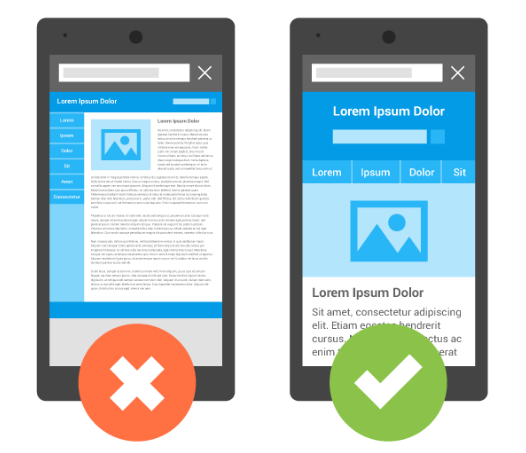
The design is one of the key factors in determining the success of a mobile website. The screen size and interactivity on different computers and mobile phones are different so that when you design the interface of a mobile website, attention should be paid to these points. If the interface of the mobile website is not convenient, lacking visibility or incompatibility for phone users, it will definitely make them leave. Some things to note about designing for the mobile website:
Because the screen is small, you should pay attention to the design of buttons and links so that it is clear and easy to manipulate. The email addresses are set with “mail to” so that users can easily send emails, the phone number has a “click to call” function to make it more convenient for the user.
If the content needs to display a lot, it should be designed so that the reader can pull down to see, not drag sideways. Although mobile websites and computer websites may be two separate and distinct websites, they should also follow specific brand identity standards. This is very important because it helps the user feel that they are on the same site, not pushed away and help them remember your brand longer. Brand recognition can be complied with by following the standard colors of regular websites and logo templates.

2. Optimize page load speed
Page load speed has a significant impact on the user experience on mobile websites. According to the studies from Nielsen, a mobile website should be loaded in 1-2 seconds to provide users with the best possible experience. If it takes more than 3 seconds to load a website, that will make the users impatient and after 10 seconds, most users will leave the website. Currently, the average speed of websites is about 5 seconds. If you can do anything to optimize web page load speed, even only 0.5 or 1 seconds, you need to do it.

3. Orientate and interact with website
Most people feel that website browsing speed and website loading speed on mobile devices are slower than on the computer, so one of the important things you need to keep in mind is to minimize the number of pages to the simplest level possible. Users do not like to click multiple times to reach the content they need to search. Therefore the website structure should be as simple as possible, allowing users to access information faster and easier. Users should not have to click more than 3 times to reach the page they want.
On the limited interface of the phone, navigating between pages, as well as between tabs, is more difficult on the computer. So, if you have to load new pages on a new tab, your mobile website needs navigation and instructions to help users get back to the original page if they want the quickest way. Ideally, pages should always have a home key and return to the previous page so that users can use easily.
Typing on the phone, though, has many improvements but still cannot be as fast and comfortable as typing on the computer. So let’s add auto-suggest, auto-complete features to the content boxes that may confuse the user by pressing too much on the phone.
The above is just an overview of what you can do to optimize your mobile website for both conversion and mobile SEO. Hope it will be helpful to you.